Government 24 Mobile App
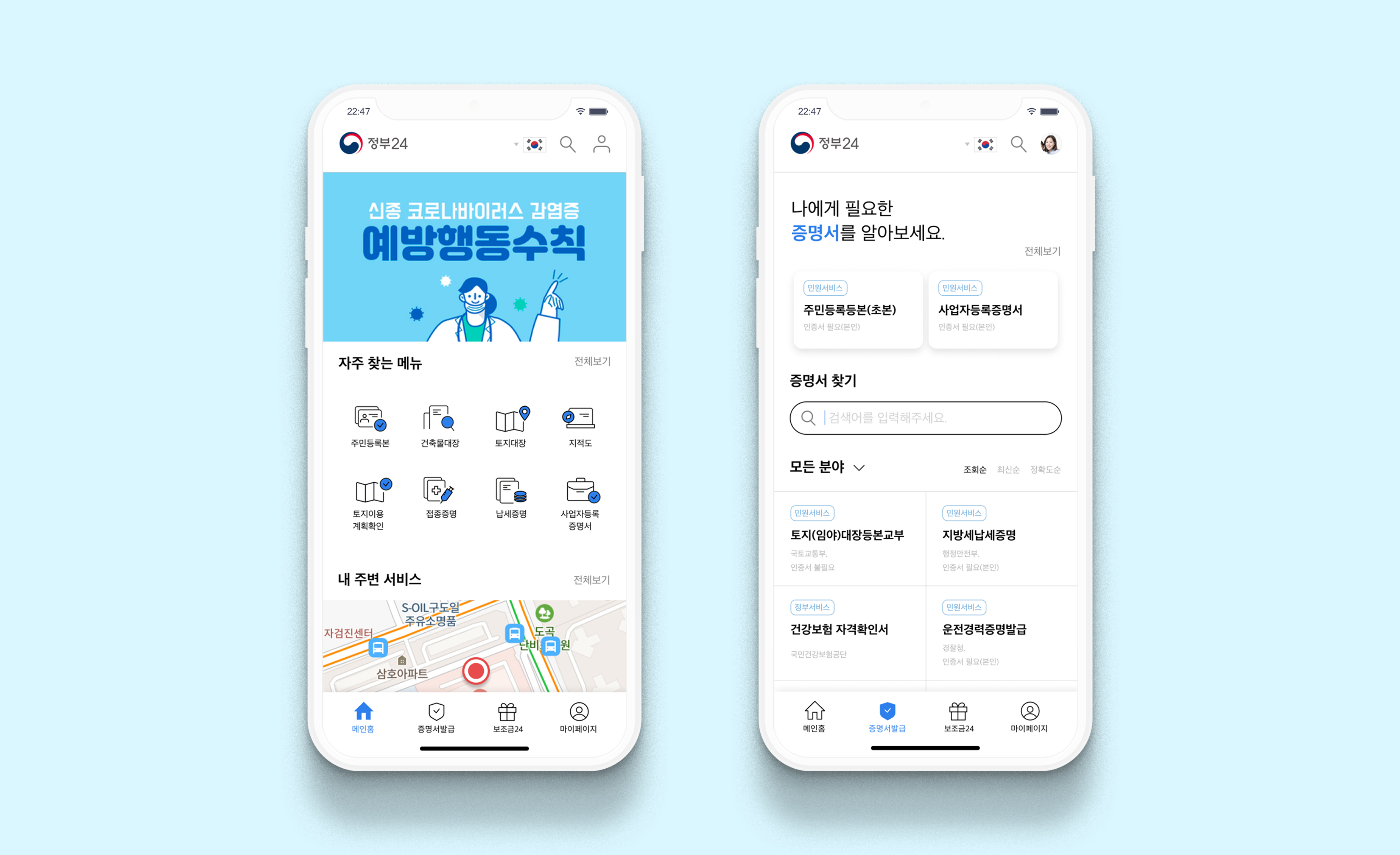
Designing national digital services that improve accessibility, trust, and service navigation for millions of domestic and overseas users.
Childhood sedentary behaviour is increasing, driven by screen time, lack of structured activity, and low intrinsic motivation. Existing interventions often rely on instruction rather than engagement, resulting in poor long-term adherence.
The challenge was to design an intervention that:
- Motivates children intrinsically rather than through compliance
- Is developmentally appropriate and inclusive
- Aligns with NHS health objectives while remaining playful and engaging
Objectives
The project aimed to redesign Government 24 to better support a diverse, national user base by:
- Improving readability and accessibility, particularly for senior citizens
- Reducing friction in sign-up and authentication flows
- Simplifying navigation across a wide set of government services
- Enabling personalised access to frequently used and stakeholder-prioritised features
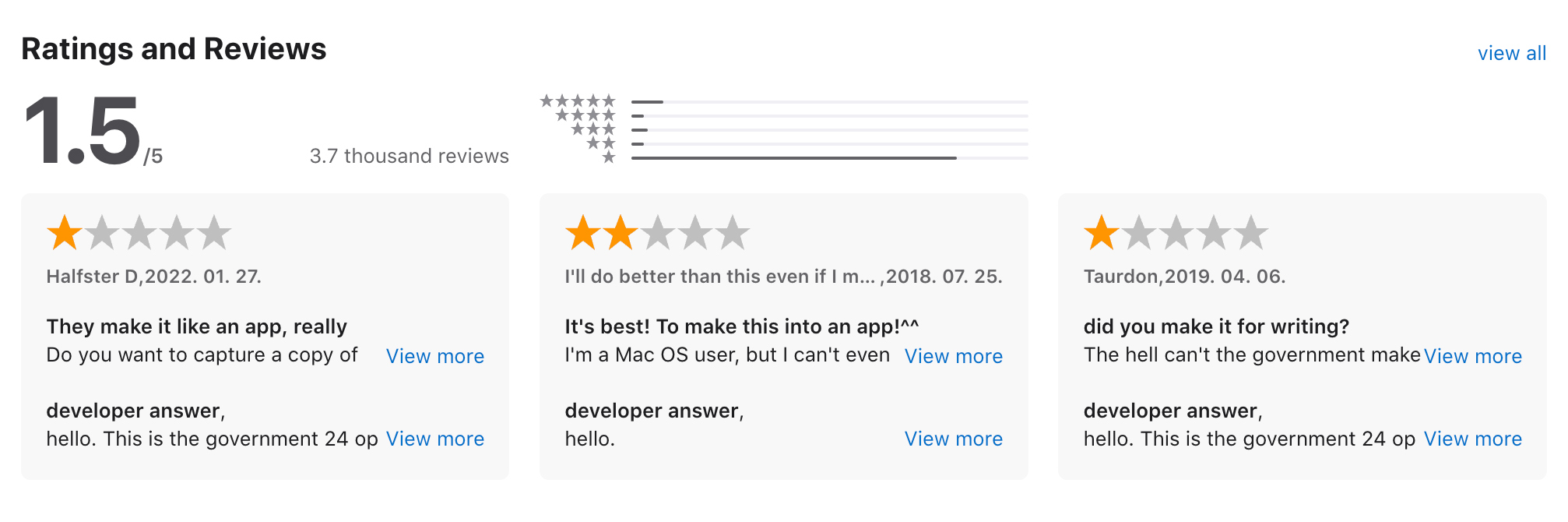
Qualitative Research
I combined expert evaluation and user research to identify systemic usability issues and validate task-level pain points across key user groups.
A heuristic evaluation of the Home and Special Features sections surfaced structural and interaction-level friction impacting task completion. These findings were then validated through interviews with 15 users across four age-based personas.
Insights from both inputs were synthesized into persona-based user flows, highlighting breakdowns in navigation, comprehension, and discoverability. This synthesis directly informed prioritization and design decisions in subsequent iterations.
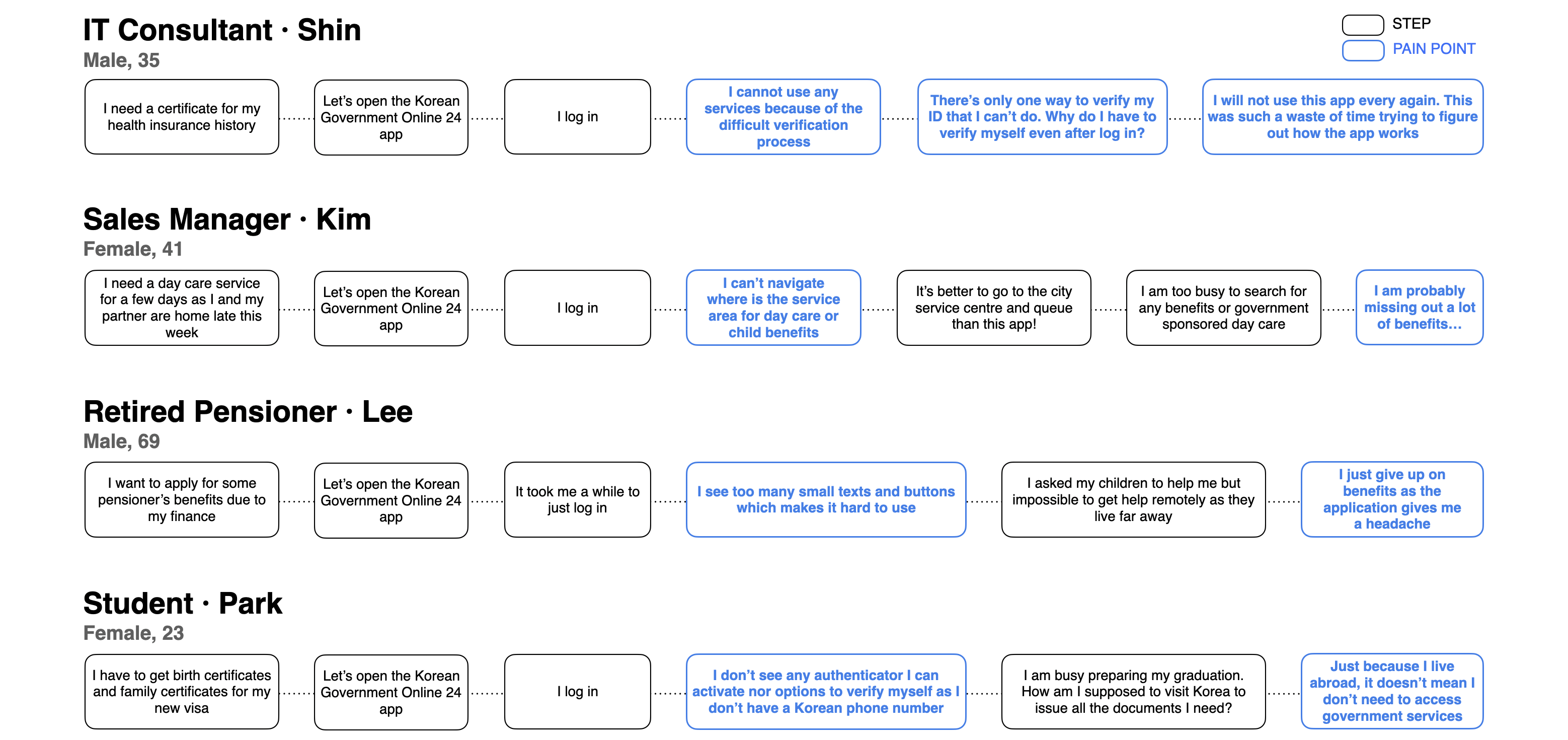
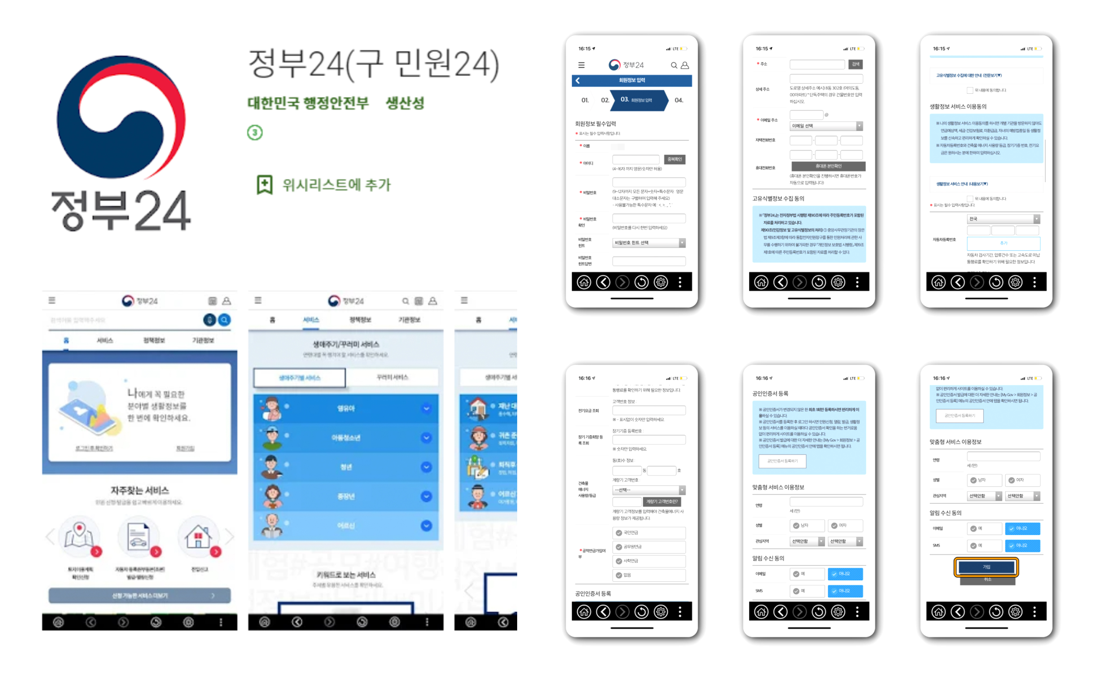
The heuristic evaluation surfaced systemic usability and accessibility gaps across Home and Special Features, with disproportionate impact on senior users and high-frequency tasks.
Key issues included inefficient navigation and spatial layout, which increased scrolling and cognitive load, particularly for location-based services. Authentication and certificate issuance flows introduced unnecessary friction through rigid verification, complex steps, and unclear feedback. Across the experience, accessibility shortcomings—notably small text, weak visual hierarchy, and lack of contextual cues—reduced task efficiency and user confidence.
Quotes from Interview
Research indicated that the redesigned app needed to modernize identity authentication, improve accessibility and readability, and reduce cognitive overload caused by presenting too many irrelevant services. Users expected a more personalized experience, with clearer prioritization of benefits relevant to their profile, and more efficient navigation—particularly for location-based services.
Design Direction
Increase accessibility and flexibility
- Support modern authentication methods (biometrics, PIN, PASS app)
- Provide adjustable text sizes to accommodate diverse accessibility needs
Personalize services and benefits
- Surface customized services and benefits based on user profile and preferences
- Introduce "Services Nearby" with location-based filtering
Improve navigation and spatial clarity
- Reduce text-heavy layouts in favor of clear visual hierarchy and iconography
- Optimize map-based components to improve discoverability and reduce steps
- Enable location-aware service recommendations
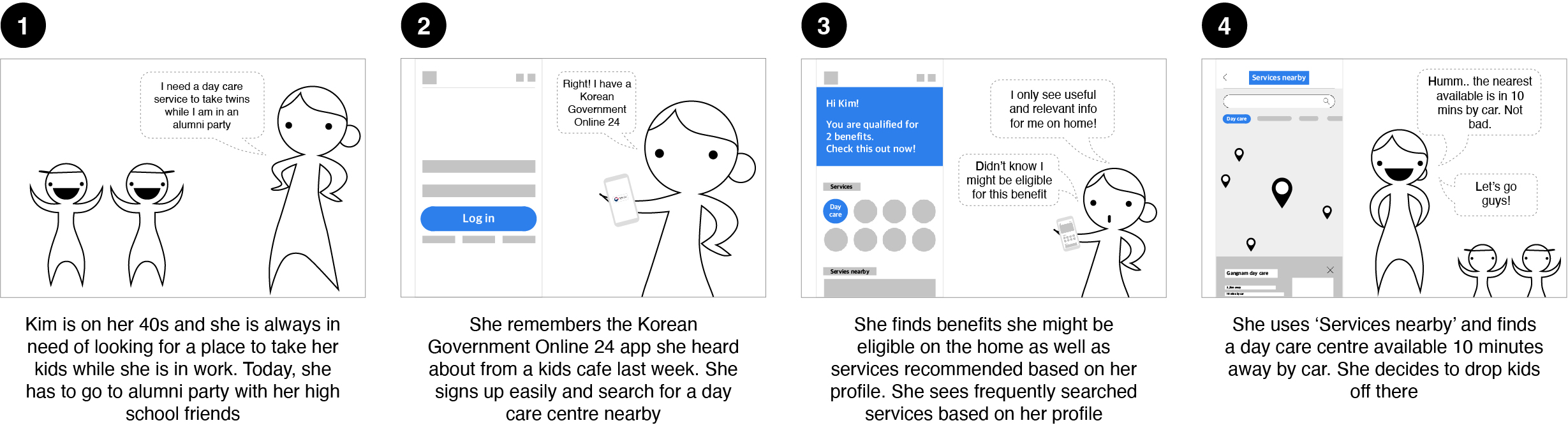
A storyboard anchored on a high-frequency working-parent persona informed end-to-end flows. The resulting insights were translated into a menu hierarchy diagram that served as the IA blueprint.
Research indicated that the redesigned app needed to modernize identity authentication, improve accessibility and readability, and reduce cognitive overload caused by presenting too many irrelevant services. Users expected a more personalized experience, with clearer prioritization of benefits relevant to their profile, and more efficient navigation—particularly for location-based services.
Introduce options such as biometrics, 4 digits PIN, PASS app (a most commonly used app for ID authentication in Korea) for log in and sign up
My page to overview certificates and benefits history at a glance
Show customised main service banners and benefits on home based on user profile and preference settings
Widen the width of map area of 'Services nearby' for easy navigation of services and provide location based service recommendations with filters
Issue certificates simply with a few steps
Manage certificates and verify them simply with a few steps
Due to time and scope constraints, full end-to-end validation was not conducted for all redesigned flows. However, the design direction is grounded in established usability heuristics, accessibility standards, and validated patterns from user research and heuristic evaluation.
Key assumptions—particularly around simplified authentication, personalized service discovery, and improved navigation—will require formal validation through usability testing and behavioral analysis. These activities are planned as part of future iterations to confirm effectiveness, identify edge cases, and de-risk broader rollout.
Impact
- The redesigned experience is expected to increase adoption by reducing friction across high-frequency tasks and improving accessibility for a broader user base, including senior citizens and overseas users.
- User testing and interviews indicate strong improvements in usability and clarity, suggesting higher satisfaction and app ratings following implementation.
Future iterations should focus on scaling accessibility, personalization, and navigation efficiency across the broader service surface.
Priority areas include further simplifying authentication to better support overseas citizens, expanding personalized and location-aware service discovery to reduce unnecessary browsing, and continuing to refine information hierarchy so users engage with relevant, high-value services rather than overwhelming system-wide content.
These improvements would strengthen long-term adoption by enabling faster task completion, clearer decision-making, and more frequent, purposeful use of the app.