trivago Search Slideouts
Designing a core search comparison experience that improves evaluation speed and decision confidence across a global travel marketplace.
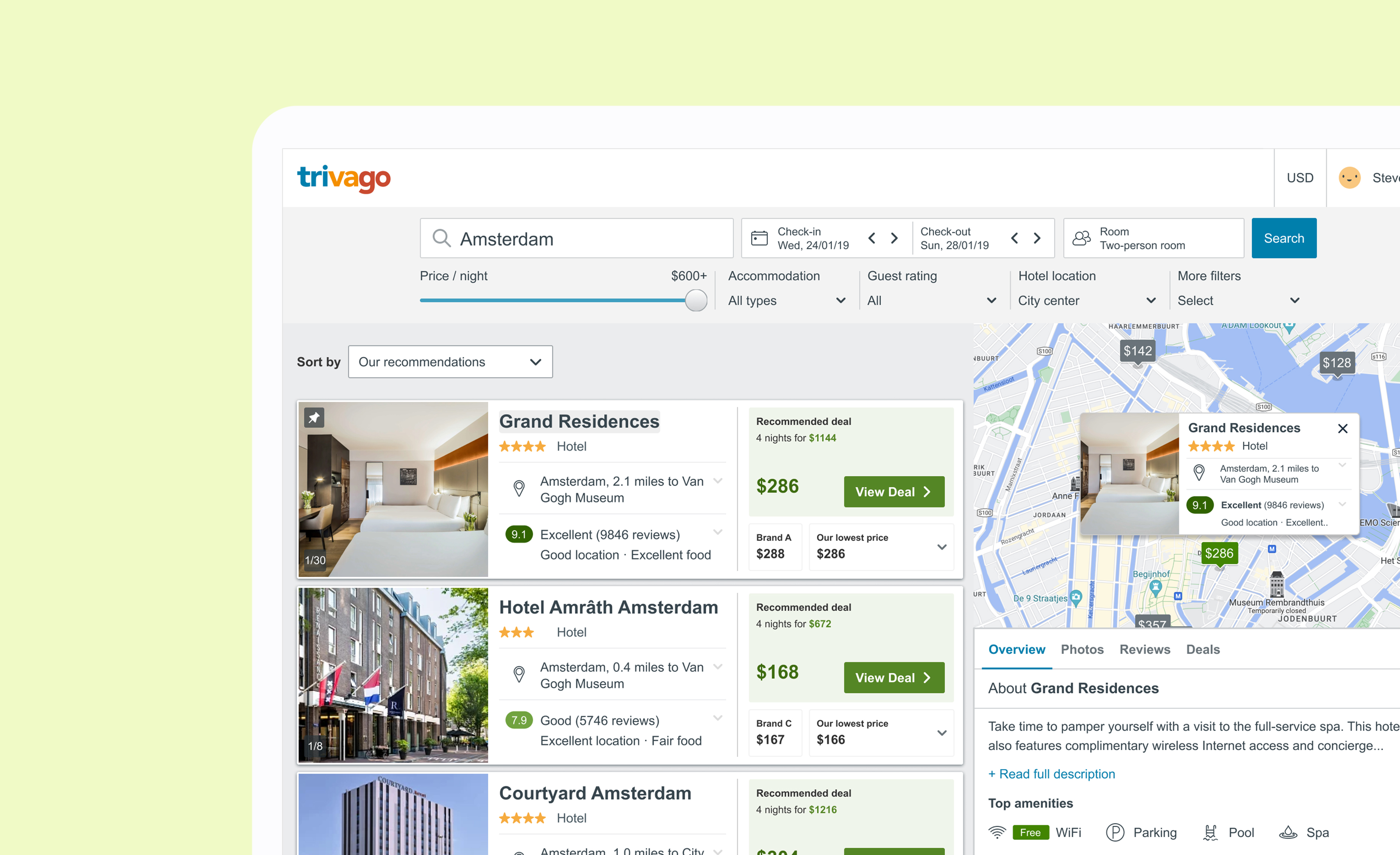
Global B2C travel platform used by millions of travelers worldwide. · B2C hotel search · 190+ countries






Slide-outs are a core interaction on trivago's B2C platform, surfacing critical accommodation details during comparison. However, the existing experience made it difficult for users to scan and compare information efficiently, increasing cognitive load and reducing decision confidence.
The challenge was to redesign the slide-out to support faster comprehension and confident choices at scale, as part of trivago's post-COVID design renewal.
Objectives
- Allow for easy and intuitive comparison across results
- Respect the original entry-points, call-to-actions, and the information they lead to
- Ensure how to best organise the content to make it usable and digestible
- Ensure users can seamlessly click out to partners' pages ('View deal')
Quantitative Research
Conducted user interviews and telephone surveys with 15 participants to understand how the existing slide-out experience aligned with user expectations during accommodation browsing and comparison.
I evaluated the existing experience to identify where the interface supported efficient comparison and where it introduced friction, using these insights to define clear design priorities and trade-offs for the redesign.
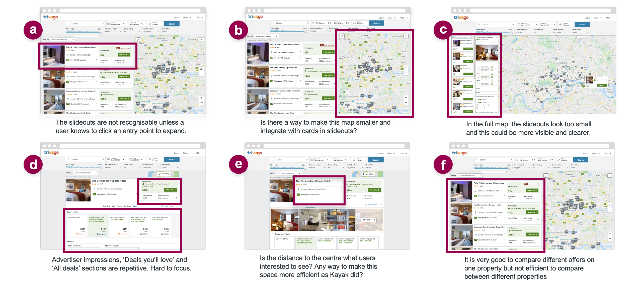
- Slide-outs were not perceived as a decision-making surface.
- Comparison across properties was inefficient and memory-dependent.
- Poor hierarchy and spacing increased cognitive load.
- Clarity and spatial balance mattered more than feature expansion.
Based on qualitative research, heuristic evaluation, and journey analysis, I defined a clear set of requirements to guide solution exploration and de-risk design decisions:
- Enable efficient cross-property comparison without context switching or increased cognitive load
- Make secondary interactions immediately discoverable, eliminating reliance on prior knowledge
- Optimize information density so critical decision data is visible within the initial viewport
- Preserve primary conversion and partner flows to avoid regressions
- Scale across list, map, and hybrid layouts for long-term extensibility
Solution Exploration & Trade-offs
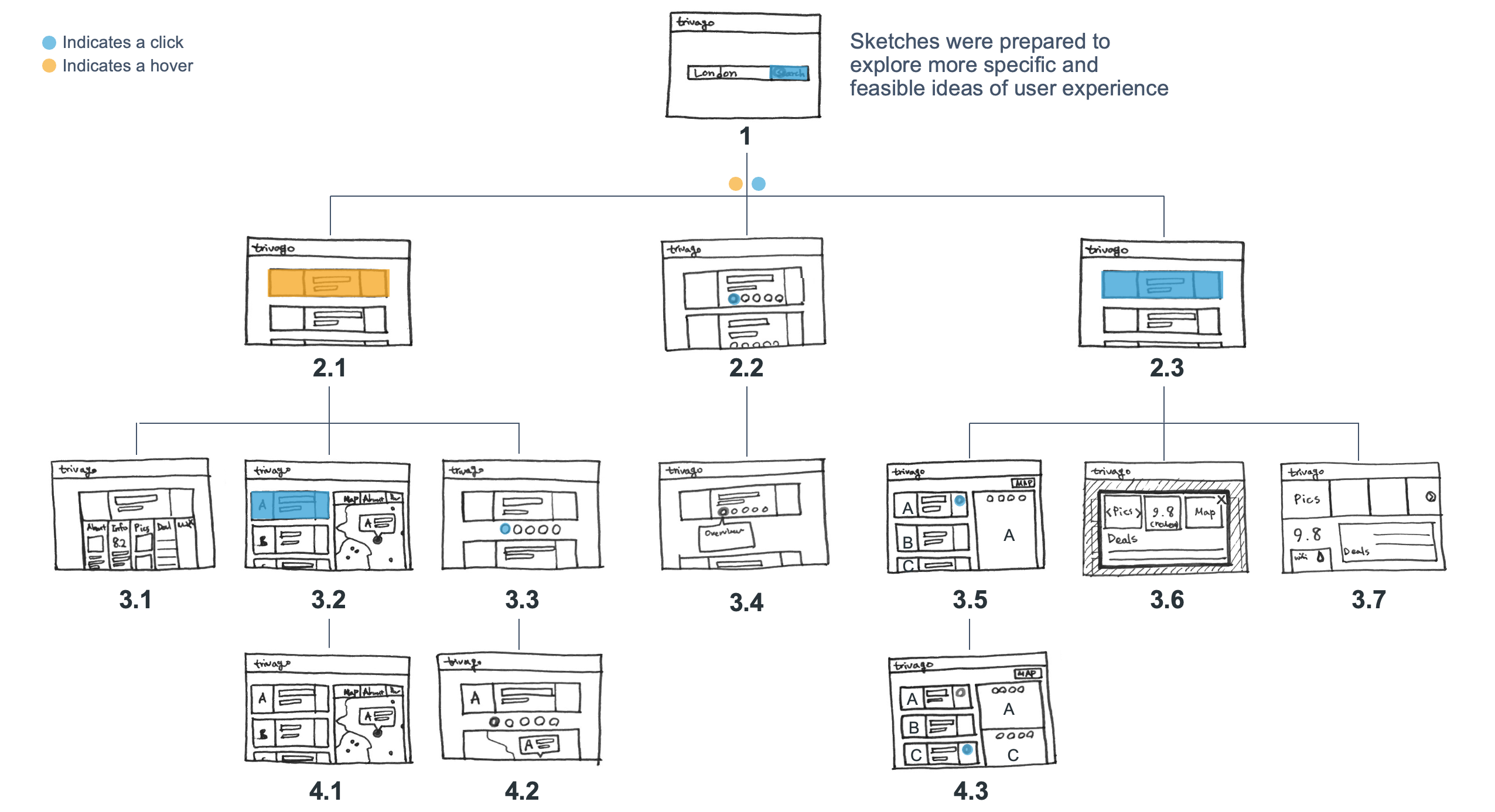
I explored multiple interaction models to evaluate trade-offs between discoverability, cross-property comparison efficiency, and spatial constraints. Early sketches were used as decision tools to test which patterns reduced cognitive load while preserving browsing continuity.
Decision Synthesis
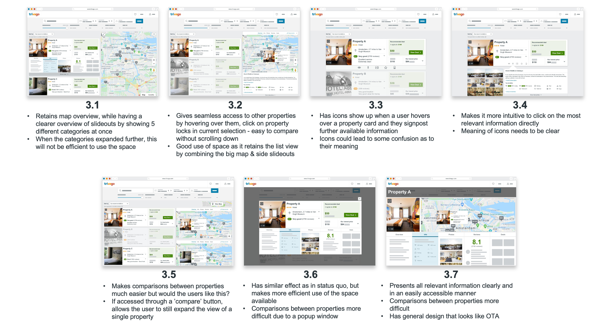
I explored multiple interaction models at mid- and high-fidelity to assess how effectively each supported cross-property comparison, spatial efficiency, and decision confidence. Each direction was evaluated against explicit success criteria, enabling rapid convergence on the most viable solution.
Direction 3.2 was selected as the foundation, as it best balanced comparison efficiency, spatial context, and scalability — directly addressing the core user and business constraints surfaced through research.
Concept Selection & Rationale
- Decision: Direction 3.2 was selected as the primary design direction.
- Why: It best balanced spatial efficiency and cross-property comparison by preserving list context while integrating map and slide-outs.
- Impact: Enabled faster decision-making, improved information density, and provided a scalable foundation for future iterations.
Prototype
A high-fidelity prototype synthesized insights from research, concept exploration, and design evaluation. It was used to validate decision confidence, interaction clarity, and scalability through user testing.
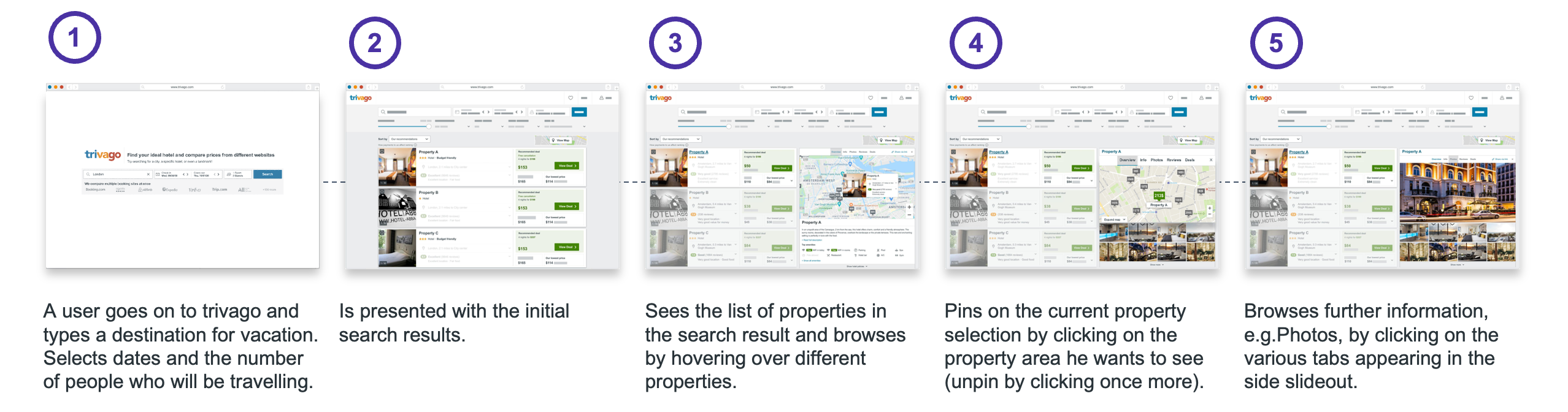
User Testing: Focus Group
A remote focus group with two persona-representative users was conducted to validate the 3.2 prototype. Feedback focused on interaction clarity, comparison efficiency, and decision confidence across frequent and infrequent usage patterns.
- Clearer signposting of slideout sections: the 3.2 prototype improved discoverability of detailed property information, with participants noting clearer guidance when navigating sections.
- Demand for cross-property comparison: participants highlighted difficulty comparing multiple properties, reinforcing this as a high-value opportunity.
- Improved prioritisation of decision-critical space: participants responded positively to the slideout taking visual precedence, supporting more focused property evaluation.
Quotes from Focus Group
Impact
A one-month global A/B test (10% of traffic) resulted in a ~3% lift in users progressing to the payment page, validating the design direction and supporting further investment.
With the core direction validated, subsequent iterations focus on targeted experiments to optimize comparison efficiency, clarity, and conversion — building a scalable foundation through continued validation and behavioral analysis.
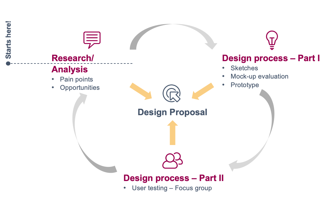
With the design direction validated, the focus shifts to scaling confidence and impact through continued validation and iteration.
Targeted experimentation and behavioral analysis will refine comparison efficiency and decision support, while systematic capture of learnings ensures insights compound across teams and future work.